
Project Information
- Category: Data Visualization & Analytics
- Client: Ancap
- Date: 2025
- Technologies: Power BI, DAX, Excel
- Role: Full-Stack Developer
Supplier & Product Performance Dashboard
A multi-page Power BI report built for ANCAP to replace manual Excel tracking with an interactive dashboard for analyzing supplier purchasing and sales performance over time.
What it does
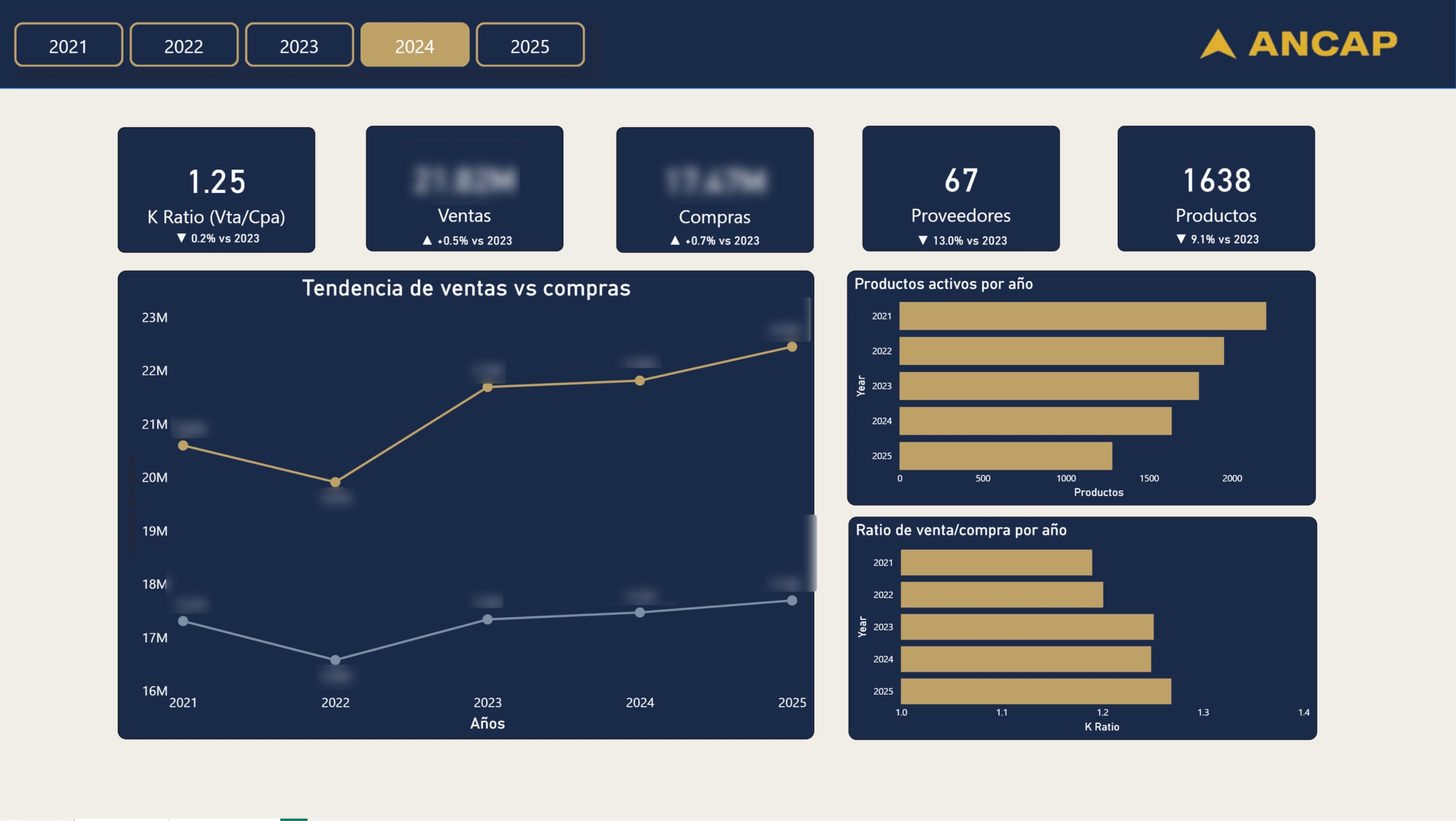
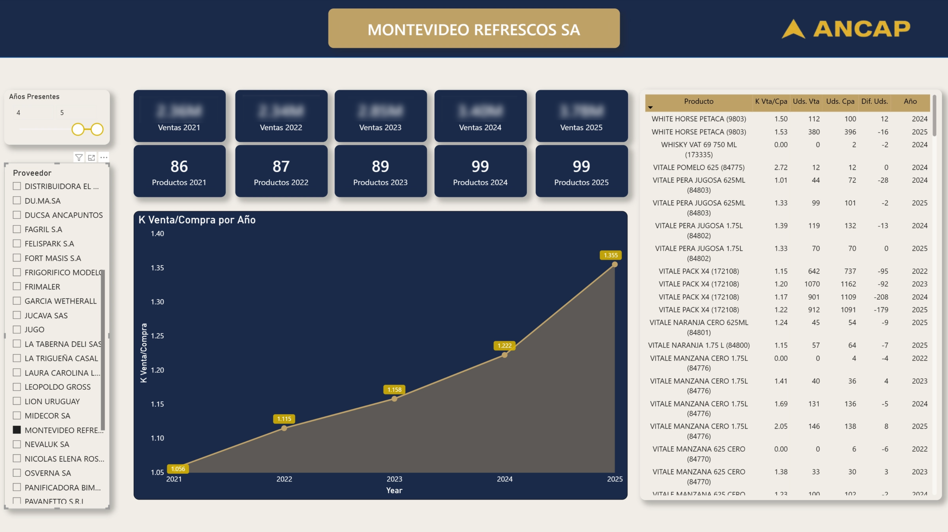
The dashboard ingests five years of historical purchase and sales data (2021–2025) and surfaces product-level and year-over-year performance metrics through interactive visuals. Stakeholders can filter by supplier, product, year, and activity range to drill into specific trends — from overall volume down to individual SKU risk flags.
Features
- KPI cards for total ventas, total compras, K Ratio (Vta/Cpa), active suppliers, and product count — each with YOY delta badges vs. the prior year
- Multi-year trend line chart comparing ventas vs. compras from 2021 through 2025
- Product-level table with K ratio, units sold, units purchased, and unit delta per year — with conditional formatting highlighting at-risk products (low margin + no inventory deficit)
- Supplier slicer with a “years active” range filter instead of raw year selection
- K Vta/Cpa area chart showing margin efficiency trend over time per supplier
- Horizontal bar charts for products active per year and K ratio by year
- Full ANCAP brand theme — navy background, gold accents — built via a custom JSON theme file, rebuilt from scratch after a OneDrive sync corruption destroyed the original .pbix
- DAX measures for K ratio, YOY comparisons, unit diff, supplier year count, and a product risk flag (“At Risk” when K < 1.1 and unit diff ≥ 0)